

People are better able to identify, recall, and trust a company when it has a strong visual brand identity. It integrates the visual choices used to represent a business on websites, packaging, social media, ads, presentations, and physical locations. When these decisions are made consistently, the company becomes more identifiable and makes a better impact in the marketplace.
A visual identity of a brand encompasses more than just a visually appealing logo or color scheme. It should convey the customer experience, positioning, values, and personality. When consumers see the same visual language over and over again, they start to identify it with the company, which eventually makes the brand simpler to remember.
What Is Visual Brand Identity?

The entire visual system that a company uses to represent itself is known as its Visual brand identity. Logos, colors, typography, photographs, illustrations, icons, layouts, and other design elements are all included. These components should support the company’s overall positioning and convey a single, distinct personality.
Additionally, a successful identity should be adaptable enough to function in a variety of media. A logo that is effective on a website should also be appropriate for digital ads, social media, business cards, packaging, and signage.
Why Visual Consistency Matters

A visual identity of a brand should be consistent throughout all consumer interactions. Even if the format or platform changes, every encounter should seem to originate from the same company.
A brand can benefit from strong visual consistency:
- Boost customer recognition more quickly.
- Make a trustworthy and professional impression.
- Boost uniformity between online and offline platforms.
- Set itself apart from comparable rivals.
- bolster enduring consumer recall.
Key Brand Identity Elements
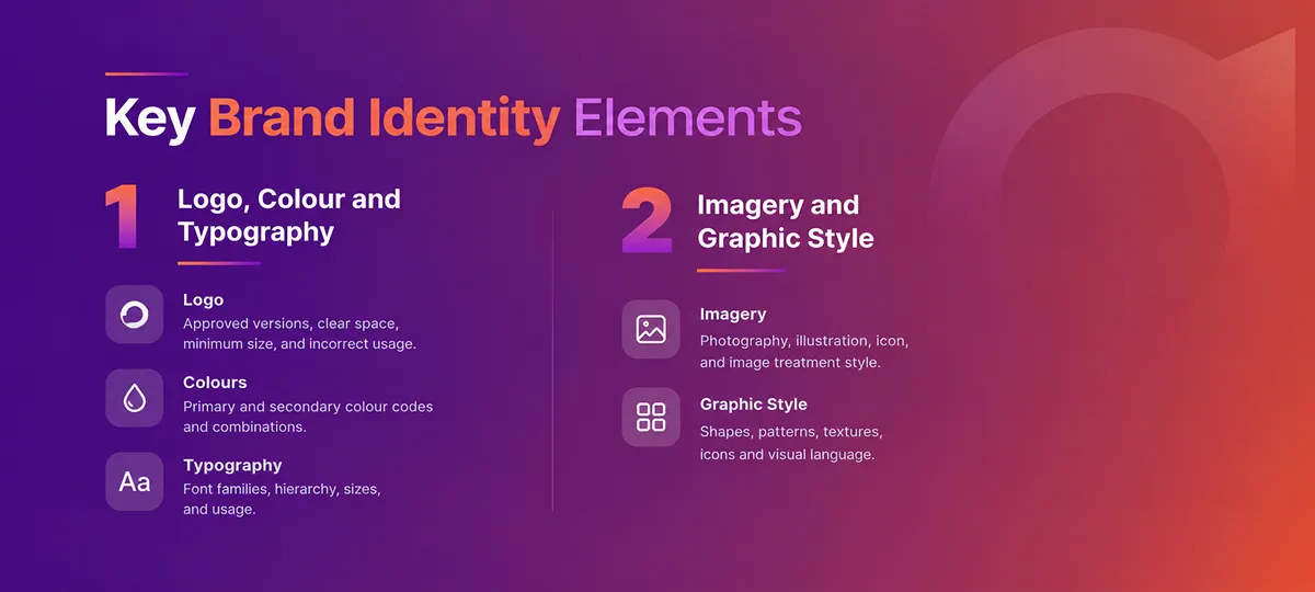
The most crucial components of a brand identity elements should work as a cohesive system as opposed to discrete design aspects. Images, layouts, typography, color, and design elements should all complement one another and convey the same personality. A well-planned Brand Identity helps businesses create a consistent and memorable presence across every customer touchpoint.
Logo, Colour and Typography
A company’s logo serves as its principal means of identification. It should be unique, scalable, and useful in a variety of formats. While font aids in personality communication and preserves readability, colors can enhance recognition and evoke strong feelings.
While a younger brand might employ brighter colors and more expressive type styles, a high-end company might utilize sophisticated font and a restrained color scheme.
Imagery and Graphic Style
Important components of a brand identity elements include photography, illustrations, iconography, patterns, forms, and visual treatments. When they are used regularly, marketing communications feel cohesive and expert.
For instance, one firm might employ vibrant lifestyle photos with upbeat compositions, while another might use clean product photography with gentle lighting. If the style aligns with the brand’s positioning, both can be successful.
How to Build a Strong Visual Brand Identity
Understanding the company before designing is the first step in creating a successful visual brand identity. The business should have a comprehensive understanding of its target market, goals, character, rivals, and market position.Strong Branding for Small Businesses can help emerging companies build recognition, trust, and a more professional market presence.
Strong development procedures ought to comprise:
- Investigating the expectations and target audience.
- Examining rivals and category norms.
- Defining the ideal personality of the brand.
- Creating a unique typographic, color scheme, and logo.
- Verifying the identity in practical applications.
Apply the Identity Across Platforms
The design system should work across websites, packaging, social media, print, advertising, signage, and retail spaces without losing recognition.
A strong identity should also be adaptable. Social media may require flexible templates, while packaging may need a more structured layout system. The overall look should remain connected even when the format changes.
How to Create a Branding Strategy
Prior to creating the graphic direction, it is crucial to comprehend how to create a branding strategy. A strategy determines the brand’s target audience, what it stands for, why consumers should select it, and how it should be positioned in relation to rivals.
Additionally, knowing how to create a branding strategy keeps design from being solely influenced by trends. Instead of focusing on short-term esthetic preferences, it provides creative teams with a defined foundation for making decisions that serve long-term commercial goals.
Strategy and Design Connection
Typically, a brand strategy outlines:
- Target audience and customer needs.
- Brand purpose and long-term vision.
- Differentiation and market positioning.
- Brand personality, values, and tone.
- Customer promise and core messaging.
The visual brand identity should be guided by these strategic choices. While a young business could benefit from dynamic typography, expressive photography, and adaptable design elements, a luxury brand might require a sophisticated and minimalistic approach.
How to Create a Branding Guide
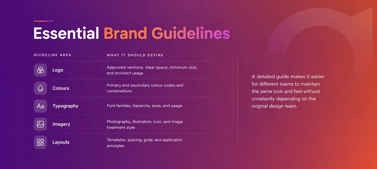
After deciding on an identity, businesses should know how to create a branding guide. The guidelines that support the consistent usage of the brand by internal teams, agencies, designers, and marketing partners are documented in a guide.
As a business expands, understanding how to create a branding guide becomes increasingly crucial. Establishing clear standards protects the brand from inconsistent visual execution, increases productivity, and decreases haphazard design selections.
Visual Identity Examples and Key Learnings
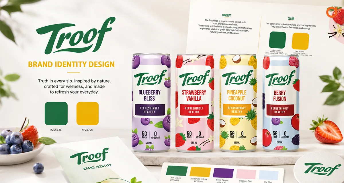
Businesses can learn how successful brands generate recognition by looking at visual identity examples. Certain brands are distinguished by their use of color, typography, symbols, packaging, photography, or unique graphic systems.
Strong visual identity examples usually share several characteristics:
- They are easy to recognise at a glance.
- They use a purposeful design system.
- They remain consistent across applications.
- They reflect the business personality and positioning.
- They can evolve without losing recognition.
The main takeaway is that intricate design is not necessarily necessary for memorable branding. Stronger recall is frequently produced by simplicity, consistency, and uniqueness as opposed to a visual system with many extraneous components. Creating Distinctive Brands requires a clear strategy, unique visual language, and consistent communication across platforms.
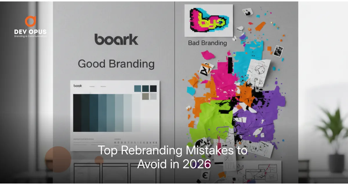
Common Branding Mistakes to Avoid
Designing without a defined strategic underpinning is a common error. If appealing images do not accurately reflect the company, target audience, or market position, they may fail.
Additionally, brands should refrain from utilizing an excessive number of unconnected colors, typefaces, effects, or graphic styles. Inconsistency and weakened recognition can result from imitating rivals, following transient trends, and changing course too frequently.
Developing an identity that is limited to a single medium is another error. Small digital icons, websites, large-format signage, packaging, print, and advertising materials should all display a strong visual brand identity.


Conclusion
Clear strategy, unique design, and reliable execution are the foundations of a memorable brand. Customers are better able to identify and comprehend a company when it has a strong visual brand identity. Brands may strengthen their long-term market presence, increase recall, and foster trust by upholding consistent visual standards across all touchpoints.
Frequently Asked Questions
Customers are better able to identify and recall a brand when it uses distinctive colors, typography, images, and consistent application.
Brand guidelines create consistent standards for logos, colours, typography, imagery, layouts, and other visual applications.
A brand should consider an update when its positioning, audience, services, market direction, or long-term business strategy changes significantly.

Mahendra Bhatiya
With 15+ years of brand-building experience, Mahendra Bhatiya helps food and FMCG businesses transform good products into trusted, memorable, and market-ready brands. His focus is on building brands that inspire stronger customer confidence, create a better market presence, and deliver long-term business value.