
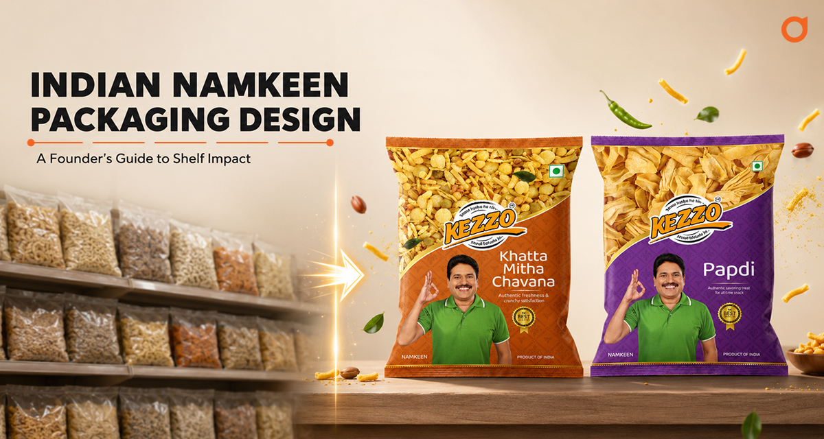
In the Indian FMCG landscape, the “savory snacks” category is perhaps the most crowded. Walk into any kirana store or modern retail outlet, and you are met with a sea of yellow, red, and orange metallic pouches.
For a founder, the challenge isn’t just making the snack taste good, it’s making the consumer trust the snack enough to pick it up. Most brands treat packaging as a container; the most successful brands treat it as a strategic asset.
The Direct Answer: What makes great Namkeen Packaging?
Effective namkeen packaging design in India must balance cultural familiarity with modern premiumization. To stand out, brands must move away from cluttered, generic templates and embrace strategic storytelling through high-fidelity food photography, clean typography, and unique structural formats that signal quality and shelf authority.
Why Packaging is Your Most Important Salesperson
In a split-second decision-making environment, your packaging does the heavy lifting. It communicates your price point, your hygiene standards, and your brand’s “personality” before the customer ever tastes the product. As a food branding expert, we often see brands spend 90% of their energy on the recipe and only 10% on the visual strategy. This is a missed opportunity for growth.
The “Yellow Bag” Trap
For decades, the yellow and red bag was the gold standard. While it worked for a generation, new-age Indian consumers, especially Gen Z and Millennials, are looking for “cleaner” brands. If your packaging looks exactly like the competitor next to it, you are forcing the customer to choose based on price alone. Strategy-first design breaks this cycle.
5 Strategic Namkeen Packaging Design Ideas for 2026
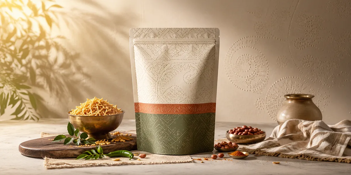
1. Modern Traditionalism
Don’t abandon your roots; elevate them. Use traditional Indian motifs like intricate patterns from the region the snack originates (e.g., Gujarati Bandhani patterns for a local Ganthiya brand) but execute them with a minimalist, modern color palette. This signals that the brand is “authentic yet global.”
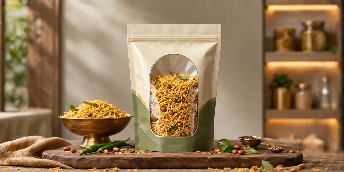
2. Window Logic: Transparency as Trust
In the Indian market, “seeing is believing.” However, a poorly placed window can make the pack look messy. Use geometric “peek-through” windows that integrate with the design. This shows the texture and freshness of the sev or bhujia while maintaining a premium aesthetic.
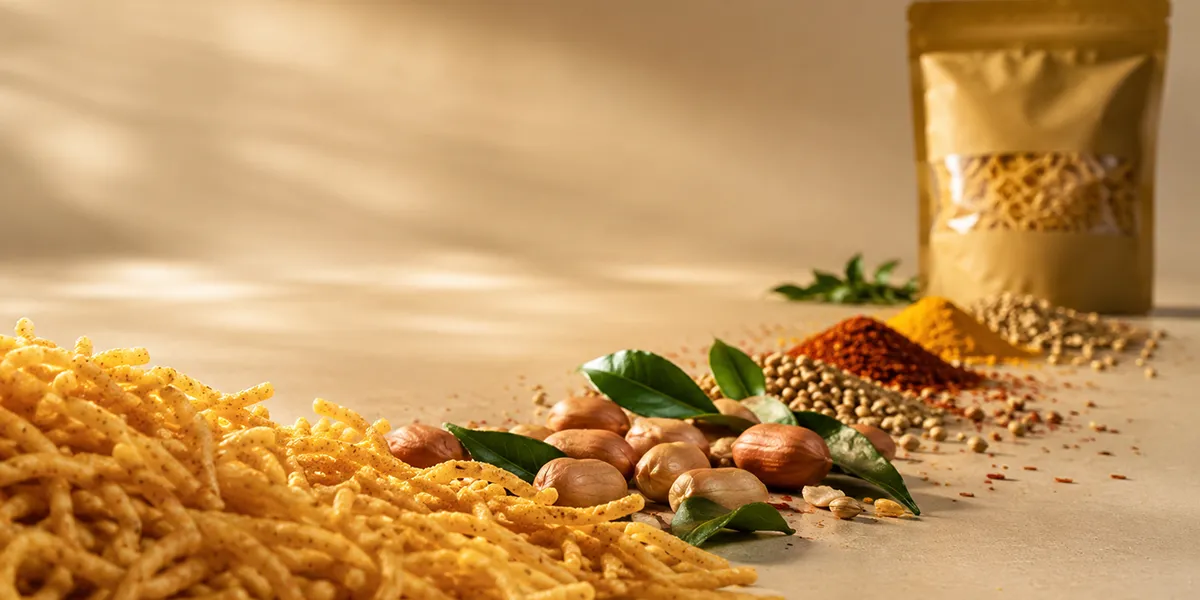
3. The "Flavor Story" through High-Fidelity Photography
Generic stock photos are the death of brand trust. To compete as a top-tier FMCG brand launch, invest in bespoke food photography. The spices, the crunch, and the ingredients should look hyper-real. When a consumer can “feel” the crunch through the image, the sale is halfway done.
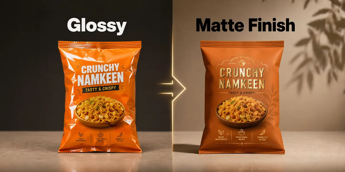
4. Tactile Textures and Premium Finishes
Move beyond the standard glossy finish. Consider matte finishes with spot-UV on the product name or the snack itself. In the premium namkeen segment, the feel of the bag in the hand often dictates the perceived value of the product inside.
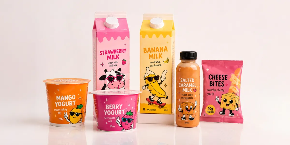
5. Storytelling-Led Illustrations
Instead of photos, use custom illustrations that tell the story of the recipe’s origin. Is it a “Dadi’s recipe”? Is it “Street-style”? Illustrations can create a unique brand world that is impossible for competitors to copy-paste.
The Dev Opus Perspective: Strategy Before Design
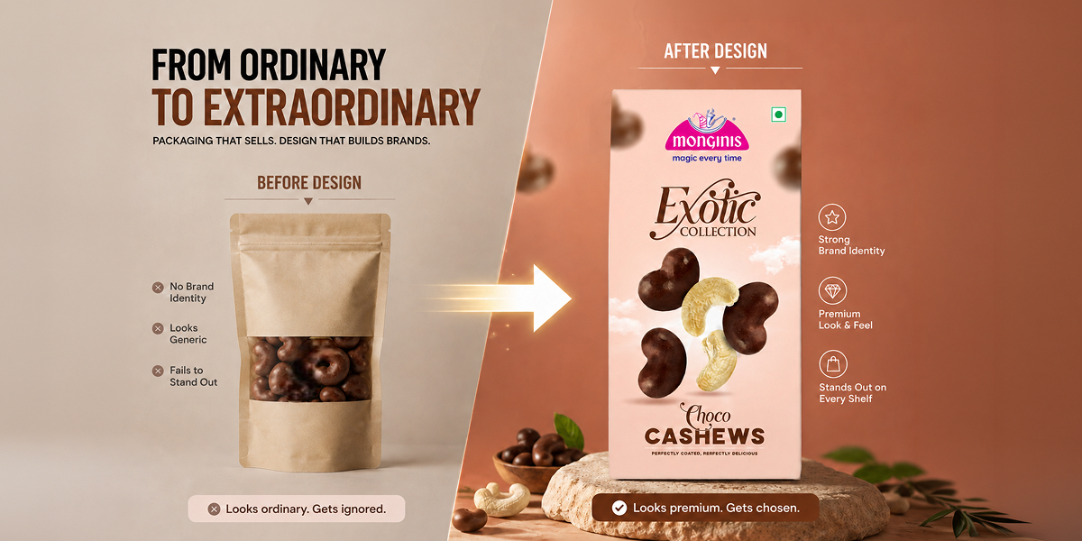
At Dev Opus, a leading branding agency in Ahmedabad, we believe packaging is the result of a strategy, not the start of it. Before we sketch a single line, we ask:
- Who is the “villain” your brand is fighting? (e.g., Blandness, unhygienic snacks, or boring health food?)
- Where will this sit on the shelf? (Visual contrast mapping).
- What is the one “Core Truth” we want the customer to remember?
When you lead with strategy, your packaging doesn’t just look nice; it performs.
Actionable Checklist for Your Next Rebrand
- Legibility Test: Can you read the product name in 1 second?
- Color Psychology: Does your color palette evoke hunger and flavor
- Social Proof: Is your packaging “Instagrammable”? (A key driver for modern snack growth).
- Sustainability: Is there a path to using more eco-friendly laminates?
Conclusion: From a Commodity to a Brand
In the world of namkeen, you can either be a commodity sold by the kilo or a brand sold by the experience. Strategic packaging is the bridge between those two worlds. If you are looking to scale, modernize, or launch, remember: your packaging is the only marketing your customer is guaranteed to see.
Frequently
Asked Questions
Asked Questions
Food branding requires an understanding of FDA/FSSAI regulations, print constraints on laminates, appetite appeal, and shelf-competition nuances that general designers often overlook.
Costs vary based on the depth of strategy, number of SKUs, and whether you require photography or custom illustrations. At Dev Opus, we focus on ROI-driven design that pays for itself through increased retail pull.
Ahmedabad is the heart of India's snack industry. Being at the center of the ecosystem allows us to understand both the traditional manufacturing roots and the modern consumer's evolving tastes.


Mahendra Bhatiya
With 15+ years of brand-building experience, Mahendra Bhatiya helps food and FMCG businesses transform good products into trusted, memorable, and market-ready brands. His focus is on building brands that inspire stronger customer confidence, create a better market presence, and deliver long-term business value.