
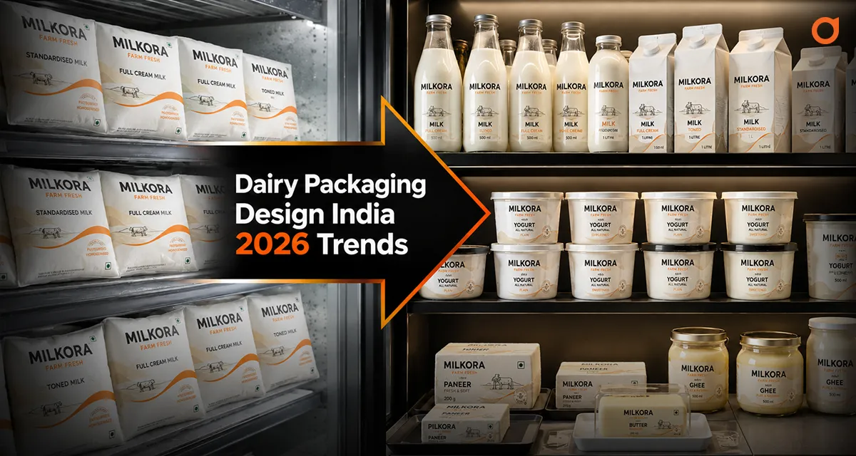
In the Indian FMCG landscape, dairy has long been treated as a commodity. For decades, the “blue and white milk pouch” was the industry standard. However, as the market matures and consumer preferences shift toward health, transparency, and premiumization, packaging has become the most critical touchpoint for building trust.
The direct answer to what makes “the best” dairy packaging today? It is a design that balances functional reliability (cold chain survival) with a strategic narrative that justifies a premium price point.
The Evolution of Indian Dairy: Why "Pretty" Isn’t Enough
A common mistake many founders make is seeking “inspiration” before defining “intent.” In a crowded retail environment, whether it’s a local Kirana store or a high-end digital supermarket, your packaging has approximately 1.5 seconds to capture attention.
For a Food Branding Expert, the goal isn’t just to make the product look attractive; it’s to build a system. In India, dairy packaging must work harder than other categories because it carries the weight of “purity” expectations. If the design feels too industrial, it loses the “farm-fresh” trust. If it feels too cluttered, it loses the “premium” appeal.
Understanding the Modern Indian Dairy Consumer
The consumer is no longer just “buying milk.” They are buying:
- Health Assurance: (A2, organic, hormone-free).
- Convenience: (Easy-pour spouts, resealable ghee jars).
- Identity: (Brands that align with their lifestyle, such as eco-consciousness).
5 Strategic Design Directions for Dairy Brands in 2026
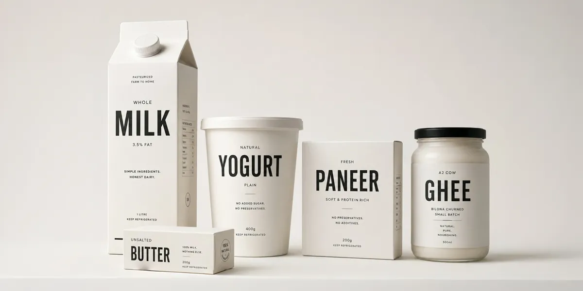
1. The "Clean Label" Minimalist Approach
Minimalism in dairy isn’t just an aesthetic choice; it’s a strategic one. By using ample negative space and monochromatic palettes, a brand signals that it has nothing to hide.
- The Idea: Use high-contrast typography and remove unnecessary “cow and meadow” clip-art.
- Why it works: It stands out instantly in a sea of cluttered, multicolored competitors.
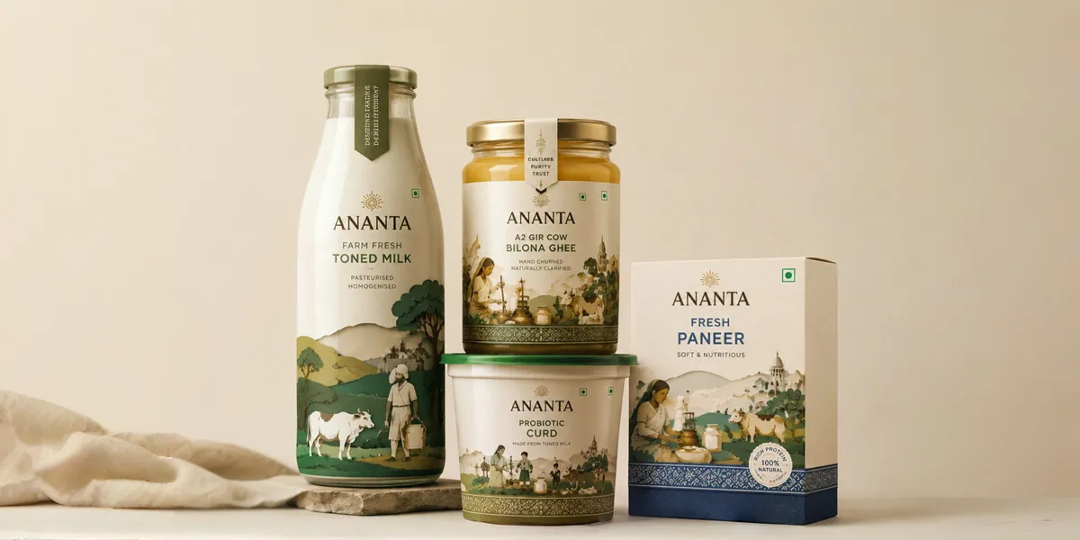
2. Modern Nostalgia: Tapping into Cultural Roots
India has a deep, emotional connection to dairy from the school milk bottle to the hand-churned ghee of childhood.
- The Idea: Use “layered paper-cut” style illustrations or traditional motifs reinterpreted with modern colors.
- Strategic Impact: It builds “Modern Trust” by bridging the gap between ancestral purity and modern hygiene standards.
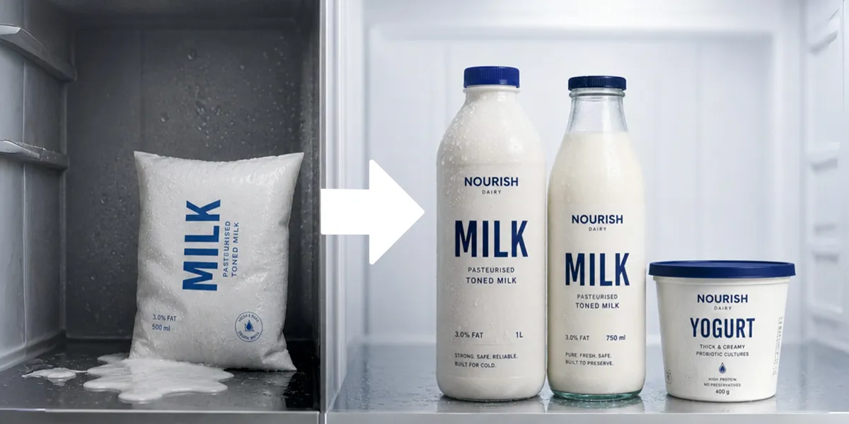
3. Functional Innovation: Solving the Cold Chain Puzzle
Packaging that fails in the fridge is a brand failure.
- The Idea: Moving from thin pouches to PET bottles or glass, or using matte-finish laminates that feel “premium” even when wet.
- Retail Impact: Better structural integrity means better shelf presence and fewer leakages, which retailers appreciate.
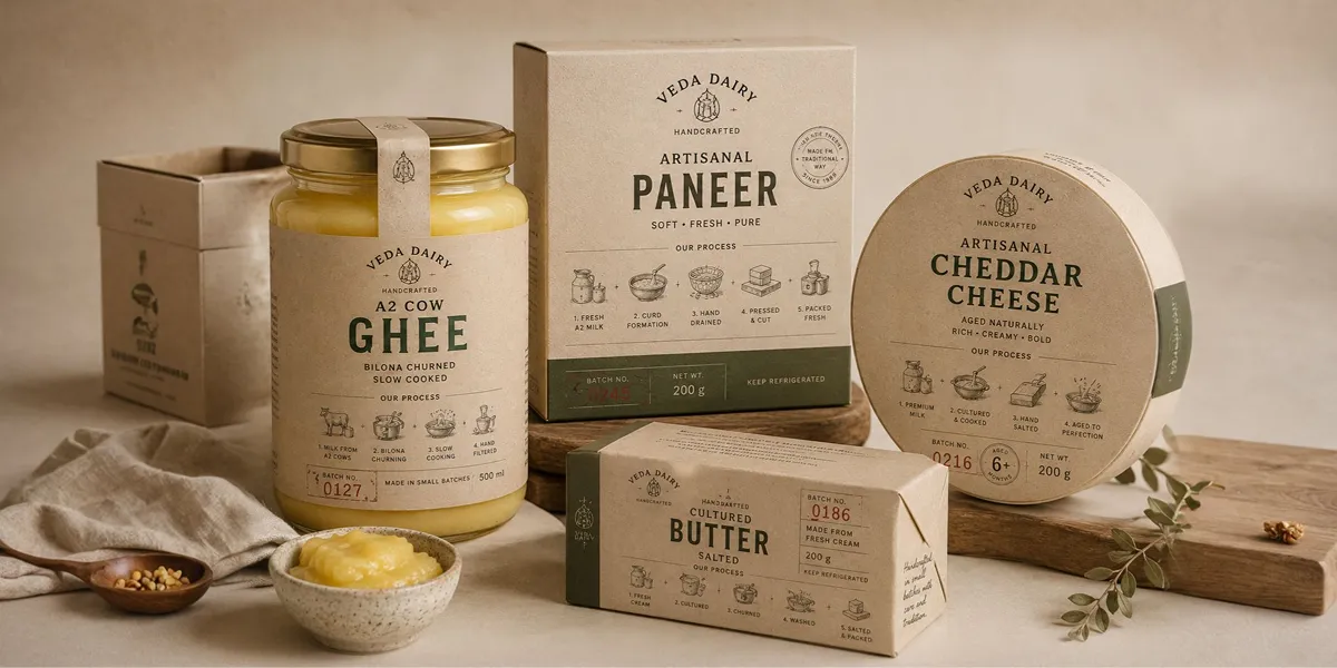
4. The "Premium Artisanal" Narrative
For value-added products like Paneer, Cheese, or Ghee, the packaging should tell a story of “process.”
- The Idea: Use earthy tones, craft-paper textures (rendered digitally), and “batch-stamped” typography.
- Why it works: It justifies a higher price point by moving the product from “industrial” to “handcrafted.”
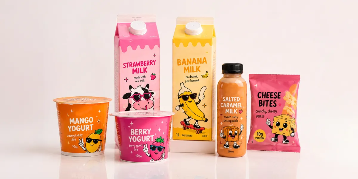
5. Gen Z Playfulness: Breaking the Category Codes
Newer dairy brands like Greto have shown that you can target a younger demographic by ditching traditional blue/green/white schemes for vibrant, high-energy colors.
- The Idea: Use bold pinks, yellows, or oranges paired with quirky, character-led storytelling.
- Strategic Impact: It turns a daily staple into a “lifestyle brand” that people want to feature on their social media.
The Strategy Gap: Why You Need a Narrative Before a Logo
At Dev Opus, we believe that design is the last 10% of the work. The first 90% is strategy. Before deciding on a color or a font, a brand must answer:
- Who are the competitors? (Is it the unorganized local milkman or the generic corporate giant?)
- What is the “One Truth”? (Is it a 2-hour farm-to-table delivery or a specific nutritional profile?)
- Where is the battle? (Quick commerce like Blinkit, or physical retail shelves?)
Conclusion: Making Your Brand "Shelf-Ready"
Dairy branding in India is no longer about just “selling milk.” It is about owning a place in the consumer’s kitchen and their trust. Whether you are a Branding Agency in Ahmedabad or a national dairy startup, your packaging is your most hardworking salesperson. It must be consistent, strategic, and human.
Frequently
Asked Questions
Asked Questions
Focus on typography and a matte-finish laminate. A clean, well-spaced font can make a standard pouch look like a boutique product without changing the structural material.
Yes, specifically for premium ghee and A2 milk. Glass signals "purity" and "eco-consciousness," which allows brands to charge a 20-40% premium over plastic.
For a premium feel, stick to 2-3 primary colors. Overusing colors can make the product look "cheap" or "mass-market."


Mahendra Bhatiya
With 15+ years of brand-building experience, Mahendra Bhatiya helps food and FMCG businesses transform good products into trusted, memorable, and market-ready brands. His focus is on building brands that inspire stronger customer confidence, create a better market presence, and deliver long-term business value.