How we arise
It all started with a hoarding. No. Wait. Let’s rephrase that! It all started with a creative hoarding. When CEO – Mahendra Bhatiya was inspired by a hoarding he decided that he will use his talent and try to make the world more beautiful.
These were the humble beginnings of Dev Creation, now Dev Opus Pvt. Ltd. With our core values in creativity, we strive to make products into unforgettable brands.
With us, you will be ready to make this world into a creative canvas that inspires people.
How we shaped our identity
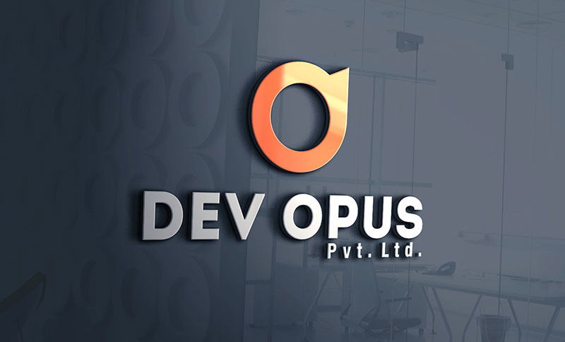
The first appearance of a logo must represent the ideation and meaning behind the name. First of all the Wordmark, the meaning of the name DEV OPUS is inspired from the owner’s grandfather name ‘Devrajbhai’ – Dev and Opus is any work of art or we can say the creation; based on that the Logomark has been designed.
In logomark, the round shaped symbol with right upward growing arrow to craft D shape as Dev word initials. Also, the upward arrow represents the development of your business. From zero to development stage and for expanding manner too.
According to color theory principles, the color – orange we have taken is the color of the rising sun. Behind the orange color psychology, it is considered as an energy and enthusiasm. Also, widely used to show creativity and grab attention like in advertising. The overall shape symbolized the rising sun with creativity towards development.