Logo Design
The logo represents assurance that the company provides to protect your family’s health to be graded like a star.
‘W’in the brand logo represents united pillars which portray family members staying united with safety and protection of health that the brand intends to provide. This is also the initial letter of the brand name.
‘Stars’ present in the logo shows how the company provides to aim Wellstar quality of protection so that your family remains united, protected and shines well like a star.
Logo Lockups
Nature is the first thing that comes to mind when we think about organic food or beverages. As the business is about organic juices which are associated with nature, we have used a “tree” element to communicate the important message of the business.
For “green products-focused” businesses like herbal and organic juices, a serene nature logo is a perfect match.
The letter “T” in Pranattva is combined with the tree element to showcase that the business is committed to providing plant-based, organic juice with sustainable packaging.

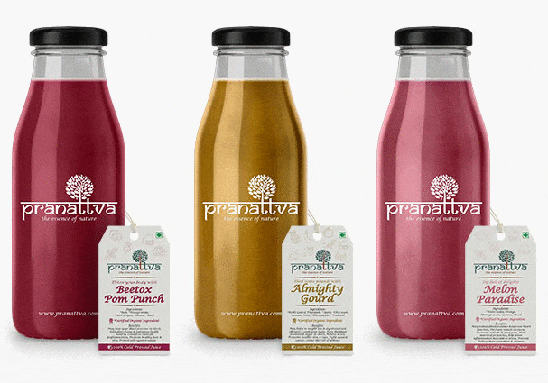
Label & Tag Design
Bottle label and tag
A good hang tag is more than just a piece of paper with the price and size written on it. While designing the label and tag we considered factors like what will work actively to sell the product, engage the customers, and encourage repeat purchases. We included important information on the tag like ingredients, benefits, flavour name, logo and a touch of design to make it more attractive.
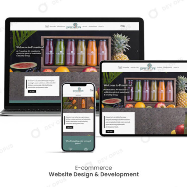
Website Design & Development
Website Design & Development
We designed and developed an e-commerce website for the client where users can customize their juice and make an online order. The website also provides important information about the products and their benefits. When it came to delivering the new website, our team went above and beyond. The navigation was simple and effective because of the design. The design was appealing and reflected the brand’s personality.


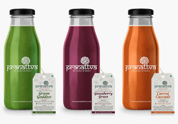
Product Photography
Product photography
Before starting the product photography, we did product styling so the product looks appealing, delicious, and fresh. We captured all the products with different backgrounds and angles to get the perfect shot. We shot the complete range of flavours, along with some combination shots of multiple bottles. The images came out eye-catching to grab the attention of the audience.