Contact Now
Location
-
Dev Opus Pvt. Ltd.
202, Chase House, Off. CG Road,
Opp Induben Khakhrawala,
Ahmedabad-380009, Gujarat.
Follow Us
We won't bore you
with long stories -
our numbers Speak Louder
with long stories -
our numbers Speak Louder
We’re your growth partner – here to bring meaningful change in the most creative and sustainable way.
0
+
700+
Happy Clients
They came, We wowed, They smiled, Repeat
0
+
1200+
Projects
Each one different, Each one unforgettable
0
+
15+
Years of Experience
Decades of insight, shaping brands that last.
0
+
20+
Dedicated Expert
Skilled minds committed to delivering excellence.
Meet the Minds


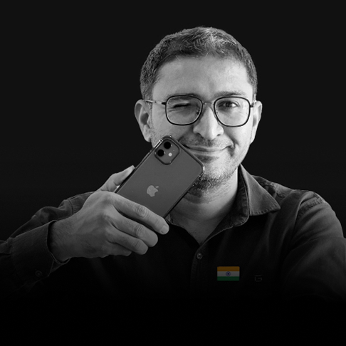
Mahendra Bhatiya
Founder Of DevOpus & Deshprem

Gautam Bhatiya
Founder Of commercial Photography

Prakash Bhatiya
Creative Head
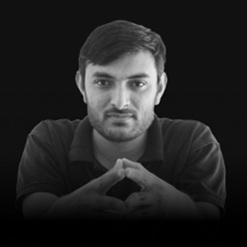

Anand Bhavsar
Digital Marketing TL

Naisargi Bhavsar
Human Resource
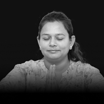

Nirali Solanki
Client Relationship Manager
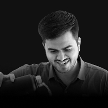

Akash Dabhi
Sr. Business Development Executive
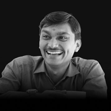

Mehul Suthariya
Photoshop Expert

Shubham Parmar
Photographer
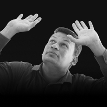

Devendra
Office Assistant


Vishal Kabira
Office Helper


Yug Trivedi
Video editor
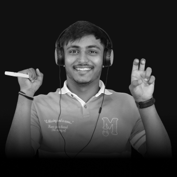
Darshan Paladiya
Video editor

Manish Kumar
Graphic Designer


Aesha Shah
Graphic Designer
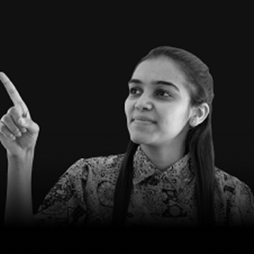

Krishna Vasoya
WordPress Developer

Parth Thakkar
WordPress Developer


Yash Vaja
UI/UX Designer

Simran Gyanani
Visual Designer Intern

Jiya Arora
Graphic Designer Intern
Itni Dur Aaye Ho Toh...
Let's Connect!
‹
Previous
›
Next
✕
Get Free Quote Now!
|
|
