A Practical Guide for Founders, Marketers & Design Students
Picture this.
You’re scrolling Instagram, and you see two ads:
- One looks cheap, cluttered, and loud.
- One looks clean, calm, and premium.
Same product category.
Same “50% OFF” message.
But you instantly trust one brand more.
Most people think it’s because of colors or photography.
Very often, it’s actually because of fonts.
The way your brand writes its name, its headline, its “Add to Cart” button – that’s typography. And in 2026, typography has quietly become one of the most powerful tools in branding.
If you’re a business owner searching for logo design in Ahmedabad, or a student dreaming of building brands one day, this guide will help you see fonts not just as “styles”… but as strategic decisions.
Why Fonts Are a Business Decision (Not Just a Design Choice)
Your logo font is not just decoration.
It decides:
- How serious or playful you look
- Whether people feel they can trust you with their money
- Whether they remember your name after 3 seconds
- How premium (or cheap) your product feels on a shelf or on a screen
Think about it:
- A thin, elegant serif feels like a boutique hotel or a high-end skincare brand.
- A round, bubbly font feels like ice cream, kids’ snacks, or a friendly app.
- A bold, condensed font feels fast, efficient, high-impact – like logistics, tech, or sports.
In 2026, we’re not just designing for visiting cards and signboards. Your logo has to survive:
- A tiny Instagram profile picture
- A noisy e-commerce listing with 10 other brands
- Reels, Stories, thumbnails, hoardings, packaging, website, and app
That’s why working with a logo design company in Ahmedabad (instead of picking a random font on Canva) often becomes a direct business advantage.
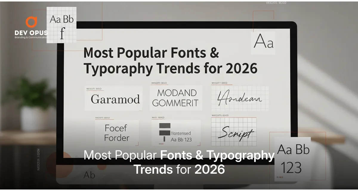
Typography Trends That Will Shape 2026
Let’s talk about the big, practical typography shifts you’ll see this year – especially in logos and brand systems.
1. Human, Imperfect Lettering for Relatable Brands
We’re leaving behind the era where everything looked too polished and corporate.
2026 is seeing more:
- Hand-drawn wordmarks
- Slightly imperfect letters
- Fonts that feel like someone wrote them, not a machine
Why? Because people respond to humanness.
If your brand is about stories, community, wellness, food, or everyday life, a slightly human, imperfect font can make you feel approachable and honest, not stiff.
You’ll see this in a lot of D2C and e-commerce brands that want to sound like a friend, not a big company.
2. Soft Curves & Rounded Sans-Serifs
Another strong visual direction: soft, rounded fonts.
These fonts are:
- Easy to read
- Friendly and warm
- Great for mobile-first brands and apps
They work beautifully for:
- Skincare and haircare brands
- Food & beverage
- Ed-tech, kids’ brands, parenting brands
- Fintech apps that want to look less scary and more helpful
If your brand talks about care, comfort, ease, safety, or joy, rounded typography supports that emotion perfectly.
3. Tall, Condensed Headlines for Mobile Screens
Open any e-commerce app:
There’s very little horizontal space, but a lot of vertical scroll.
That’s why condensed typefaces – tall, slightly narrow, bold – are becoming popular in:
- Logos with short names
- App icons
- Sale banners, hero offers, “Limited Time” headlines
They let you:
- Fit more information in a small space
- Still looks strong and impactful
- Make the brand name visible even in a crowded design
For founders running performance campaigns (Meta ads, Google ads, Amazon ads), this trend is pure gold: more legibility, same real estate.
4. Editorial Serifs for Premium & Thought-Led Brands
On the other side, we have high-contrast, editorial-style serif fonts.
These feel:
- Luxurious
- Calm
- Content-rich and “smart”
They’re a great fit if you’re building:
- A beauty or fashion label
- A boutique consultancy or design studio
- A wellness, coaching, or personal brand
- A premium hospitality or decor company
The trick is to keep the logo and main headlines in a beautiful serif, but support it with a simple sans-serif for body text and small details. That balance feels both premium and modern.
5. Dual-Script & India-First Typography
If you sell only in one metro city, you can survive with just English.
But if your growth plan includes:
- Tier 2 & tier 3 cities
- Gujarat + Maharashtra + Rajasthan + MP
- Regional campaigns during Navratri, Diwali, Uttarayan, and local fairs
…then your typography has to be Indic-aware.
In 2026, more Indian brands are:
- Designing logos that work in English + Hindi or English + regional language
- Choosing fonts that have good support for Indian scripts
- Building systems where the logo may be in English, but headlines and content can switch languages without losing style
If you’re hiring a logo design company in Ahmedabad, this is a very important conversation to have:
“How will our typography system behave when we need Gujarati or Hindi creatives?”
6. Motion-Ready Logo Fonts
Reels. Shorts. YouTube intros. Website hero animations. App splash screens.
Your logo will move.
If not today, then soon.
A motion-ready font is:
- Simple and clear in shape
- Works when it slides, bounces, fades, or stretches slightly
- Easy to read even when animated
Very complex or over-decorated fonts can look beautiful in static form but break completely in motion.
So in 2026, good logo typography = looks great in a still image + survives basic animation.
7. Minimal Font Families, Maximum Discipline
One of the strongest “trends” is actually discipline.
Brands that look strong and memorable across platforms usually do one thing well:
They don’t use ten different fonts.
They stick to:
- One logo font
- One primary font for headings and big text
- One secondary font for body copy (sometimes the same family, just different weight)
That’s it.
Three fonts, used well, beat seven fonts used badly – every single time.
What Indian Brands Are Doing Right With Typography
Let’s look at two Indian brands that consistently use typography as a strategic tool, not random decoration.
1. Nykaa – Clean, Confident, Commerce-Ready
Nykaa has grown from an online beauty store into a full ecosystem – app, content, offline stores, and its own product lines.
What stands out in their visual language:
- A logo that is edgy and instantly recognisable
- Supporting fonts that are clean, bold, and easy to scan on mobile
- Consistency across app interface, website banners, emails, and Instagram creatives
The learning: if you’re an e-commerce or D2C brand, your typography system should support fast reading and quick decisions. Nykaa’s fonts always keep the customer focused on what matters: product, offer, action.
2. Mamaearth – Friendly Type for a Caring Brand
Mamaearth positions itself as a safe, gentle, toxin-free brand for families.
Their typography follows that promise:
- Rounded, approachable letterforms
- Plenty of breathing space around text
- Clear hierarchy on packaging: brand name → product type → key benefit
Look at their social posts and packaging together and you’ll see the same tone carried everywhere: kind, modern, slightly playful, but still trustworthy.
The learning: your fonts should not fight your brand story.
If your message is “we care for your family”, but your typography feels rigid and harsh, something will feel off.
How to Choose a Logo Font in 2026 (Simple Framework)
If you’re a founder or marketer, here’s a practical way to think about your logo fonts before you even meet a designer.
Step 1: Define Your Brand in 3 Words
Pick three words that describe your brand:
- “Bold – Youthful – Affordable”
- “Calm – Premium – Minimal”
- “Fun – Quirky – Casual”
- “Serious – Expert – Reliable”
Write them down.
These are your typography filters.
Any font that doesn’t fit those three words?
Reject it.
Step 2: Match Font Family to Category
A quick cheat sheet:
- Sans-serif → Modern, clean, tech-driven, everyday use
- Serif → Premium, editorial, legacy, luxury, thought-leadership
- Rounded → Friendly, warm, safe, family-focused
- Handwritten / script → Personal, artsy, expressive (use very carefully in logos)
This isn’t a rulebook, but a good starting point.
Step 3: Test It Small, Not Just Big
A logo that looks amazing on a big mockup may die at:
- WhatsApp DP size
- Instagram profile circle
- App icon
- Tiny e-commerce listing thumbnail
Always test your logo font:
- In black and white
- On a very tiny scale
- On both light and dark backgrounds
If it fails these tests, it will give you trouble later in campaigns, packaging, and UI.
Step 4: Plan Beyond English
Ask yourself:
- Will I need regional language creatives?
- Will my brand talk to people in Hindi / Gujarati / other languages?
- Will my packaging ever carry multiple languages?
If yes, ensure:
- Your chosen font family either has good multi-language support, or
- Your logo is designed in a way that allows a second script to sit beside it without looking like an afterthought.
Step 5: Know When DIY Is Dangerous
There’s nothing wrong with browsing fonts yourself. In fact, it’s helpful.
But when:
- You’re about to invest in packaging
- You’re planning a serious online presence
- You want to scale outside your city
- You want to be remembered, not just seen
…that’s where a professional logo design company in Ahmedabad can save you from years of “almost okay” branding.
At Dev Opus, the conversation usually doesn’t start with “Which font do you like?”
It starts with:
- “Where do you see this brand five years from now?”
- “Who exactly are we talking to?”
- “Where will this logo live – shelf, screen, city, or all of them?”
The font choice then becomes a logical outcome of strategy, not a random aesthetic pick.
FAQs
Look at three things:
1. Fit – Does it match your brand personality and category?
2. Clarity – Can people read your name at a glance, even at small sizes?
3. Differentiation – Do you look slightly different from your closest competitors?
If all three answers feel like a “yes”, you’re on the right track. If you look exactly like everyone else in your category, it’s time to explore alternatives.
Yes, but do it intentionally.
Minor refinements (cleaner shapes, better spacing, small weight changes) are normal as brands mature. A sudden, drastic font change without reason, however, can feel like a different company.
If you’re planning a change, treat it as a rebranding exercise: clarify your new direction, update all touchpoints together, and communicate the shift clearly.
They can work, but only in very specific cases:
• Short brand names
• Lifestyle, fashion, creative or personal brands
• Use mainly in large sizes (not as tiny text)
Script fonts often fail in favicons, app icons, and small packaging details. If you love that style, a good compromise is: keep the main logo readable, and use script fonts as accents in your visual system.
Not necessarily, but it often helps.
• Your logo font should be distinctive and memorable.
• Your website font should prioritise readability and performance.
Sometimes they’re from the same type family, sometimes they’re different but complementary. The goal is to make the whole system feel cohesive, not identical.