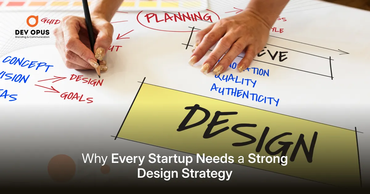
Think about the last brand or website that really stayed in your mind. Chances are, colour played a big role in it. Not just because it looked nice, but because it made you feel something.
As we move towards 2026, colours in design are becoming more intentional. Designers are no longer chasing what looks loud or trendy for a moment. Instead, they are choosing hues that reflect how people want to feel calm, optimistic, grounded, and confident.
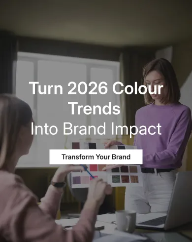
Colour trends for 2026 are shaped by global research, cultural shifts, and changing consumer behaviour. In this blog, we explore which colours will lead the design industry in 2026, why they matter, and how brands can use them smartly.
Table of Contents
Why colour trends are changing
Over the past few years, the world has gone through uncertainty, digital overload, and constant change. Naturally, design has responded.
Global trend forecasters like Pantone, WGSN, and Adobe’s Creative Trends reports have all pointed towards one common idea. People want designs that feel human, reassuring, and balanced.
That is why 2026 colour trends are less about shock value and more about emotional comfort mixed with quiet confidence.
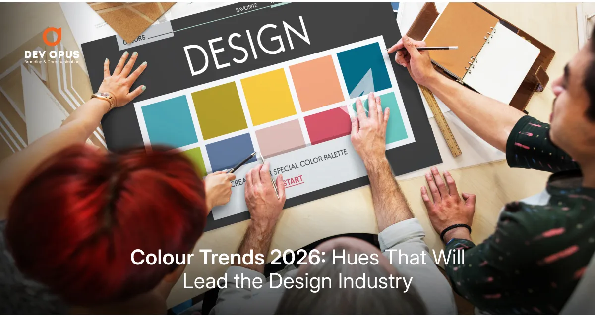
The key colour directions for 2026
1. Soft whites and airy neutrals
Pure white is slowly stepping aside. In its place, warmer off-whites and soft neutral shades are taking over. Pantone’s Colour of the Year 2026, Cloud Dancer, reflects this exact shift.
These colours feel open, breathable, and premium without being cold. They create space for content to shine and make designs feel less tiring, especially on screens.
You will see these shades everywhere, from brand websites and packaging to mobile apps and editorial layouts.
2. Teal that feels modern and dependable
Teal is emerging as one of the most important colours of 2026. According to WGSN and Coloro, Transformative Teal represents change with stability.
It blends the trust of blue with the freshness of green. This makes it perfect for brands that want to look progressive but still reliable.
Teal works especially well in technology, healthcare, education, and sustainability-focused businesses.
3. Deeper blues with personality
Blue has always been popular, but in 2026 it becomes more expressive. Instead of flat corporate blues, designers are choosing deeper ocean blues, indigo tones, and layered shades.
These blues feel more personal and thoughtful. They communicate trust while also allowing brands to stand out with subtle uniqueness.
Many finance, B2B, and digital service brands will continue using blue, but in richer and more refined ways.
4. Warm, grounding earth tones
Earth-inspired colours are not new, but their role is growing stronger. Think clay beige, warm taupe, muted olive, and soft browns.
These shades reflect a return to nature and authenticity. Paint brands and interior trend reports show that people are craving stability and grounding, and this naturally flows into branding and packaging design too.
These colours work beautifully for sustainable brands, food businesses, wellness products, and lifestyle labels.
5. Bright accents used with restraint
Bright colours are not disappearing, but their role is changing. Instead of dominating designs, bold shades like coral, fuchsia, mint, and amber are being used as highlights.
They add energy without overwhelming the viewer. A single bright button, icon, or graphic detail is often enough to bring life into a neutral palette.
This balance is what makes 2026 designs feel mature yet playful.
What these colours say about people
Colours always reflect emotions. The 2026 palette tells us that people want reassurance, clarity, and optimism.
Soft neutrals suggest calm. Teal and blue show trust. Earthy tones reflect honesty. Controlled brights signal hope and creativity without chaos.
For brands, this means colour is no longer just decoration. It is communication.
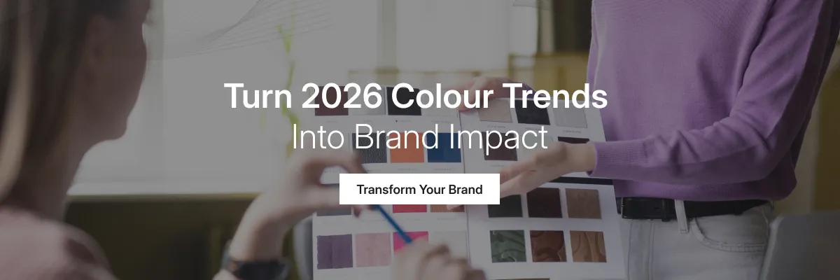
How brands can apply these trends
The smartest way to use colour trends is not to copy them blindly. Instead, brands should adapt them based on their identity and audience.
For example, a brand may keep its core colour but update backgrounds to softer neutrals or introduce a modern accent shade.
This is where working with a professional branding agency Ahmedabad helps. They understand how to turn global colour trends into a consistent visual system that actually works for the brand.
Local businesses that want to look modern without losing authenticity often benefit from guidance by a branding agency in Ahmedabad that understands both global design thinking and regional sensibilities.
Final thoughts
Colour trends in 2026 are not loud statements. They are quiet signals of confidence, comfort, and clarity.
Brands that embrace these hues thoughtfully will not just look updated, they will feel more relatable and trustworthy. And in a crowded design landscape, that emotional connection makes all the difference.
FAQs
Yes. Colour strongly influences how people perceive and remember a brand.
No. Small refinements and accents are better than frequent full changes.
Soft neutrals and deeper blues are versatile and widely applicable.
Yes, but mostly as accents rather than main palettes.
It depends on your audience, values, and long-term vision, not just trends.