
In the marketing world, brand recall is crucial. A memorable colour palette isn’t just about aesthetics – it’s a strategic tool that enhances recognition and trust. Consistent colours help people instantly recognize and trust the brand and be loyal to it. Whether in India or anywhere else, maintaining colour consistency is essential to stand out in a competitive market.
Why is Colour Consistency Important?
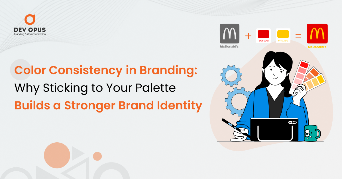
What if you saw McDonald’s using pink instead of its signature red and yellow in your city? What is the first thing that will come into your mind that this brand is duplicate or fake because it’s not in red and yellow? That is why colour consistency is important. Colours play an essential role in branding, helping people perceive your brand. Marketing studies say that most brands are judged by their colour, and the same is valid for their products.
Key Benefits of Colour Consistency:
- Instant Recognition: Consistent colours make your brand stand firm in the crowd. For example, Coca-Cola is in red, Facebook is in blue, and Starbucks is in green.
- Emotional Connection: Imagine you’re driving down the highway, feeling hungry, and suddenly you spot the iconic yellow M of McDonald’s. It instantly evokes positive emotions because you trust the brand – and you’re hungry!
- Professional Image:Maintaining colour overall builds the brand as reliable, trustworthy and organized.
- Brand Recall: The more you use your brand colour in every campaign, packaging, and advertisement, the better the consumers remember your brand.
The Adani Group is a prime example of how consistent colour usage can elevate a company into a powerful, recognizable brand. They do branding strategically with their signature colour palette to create a unified identity across the business branches.
1. Unified Brand Identity Across Diverse Sectors
Adani Group ensures that every industry, from ports and airports to energy, infrastructure, and defence, has Adani’s consistent colour palette that represents its core identity.
- The blue-to-purple gradient used by Adani represents trust, Innovation, and progress, and its key values align with its commitment to nation-building.
- This gradient colour isn’t just a visual colour. It’s symbolic and reflects Adani’s consistency across industries.
your brand's colours tell your story- make your brand stand out!
2. Signature Visual Elements
Adani’s branding and marketing are beyond just logos — they’ve integrated their colour palette into:
- Uniforms worn by staff across airports, power plants, and ports feature Adani’s brand colours.
- Billboards and their poster designs are designed according to their colour palette.
- They have maintained consistent brand colour in digital displays in airports.
- Even its port cranes, containers, and equipment have brand colours painted with shades that match the brand identity.
3. Architectural Influence
Adani has recently redesigned its airports in Ahmedabad, Lucknow, and Mumbai to reflect its brand colours, which features interiors, lighting, and even digital kiosks that reflect their gradient palette. Even their port terminals have branding colours that maintain visual continuity.
4. Marketing & Digital Presence
Adani uses its colour on all digital presences, such as the website, social media, and advertising campaigns, ensuring strong visual recall.
5. Emotional Connection through Colour
Each colour Adani used has its purpose that represents the brand.
- Blue: This colour represents stability, reliability and trust.
- Purple: This colour represents Innovation, leadership, and growth.
- Pink and Orange: This colour represents energy, progress, warmth and expansion.
- Green: This colour represents sustainability and eco-conscious initiatives primarily used in its energy projects.
6. Strategic Impact on Perception
Adani has positioned its business and brand as a trusted, future-forward, innovative brand by ensuring colour consistency. Whether you are walking in Adani’s airport, seeing any billboard, passing through its port terminals, or exploring its digital platforms, the colour palette is dominant and reliable.
Conclusion
Colour consistency isn’t just about aesthetics – it’s a strategic tool that strengthens your brand’s recognition, builds trust, and sets you apart in a crowded market. Whether you are a big brand, growing a brand, or a startup, have a strict colour palette that significantly strengthens your business identity. All big brands like Adani, Coca-Cola, and IKEA have leveraged colour to stay trusted and memorable. You can achieve the best with us, Dev Opus, a skilled Branding agency in Ahmedabad, a well-known Marketing agency in Ahmedabad, and a reputed Advertisement agency in Ahmedabad. We ensure your brand leaves a lasting impression.
Want your brand to stand out and stay unforgettable? At Dev Opus, we craft iconic brand identities through expert colour strategy. Let’s make your brand the one everyone remembers. Contact us today!