

-
Dev Opus Pvt. Ltd.
202, Chase House, Off. CG Road,
Opp Induben Khakhrawala,
Ahmedabad-380009, Gujarat.
Follow Us
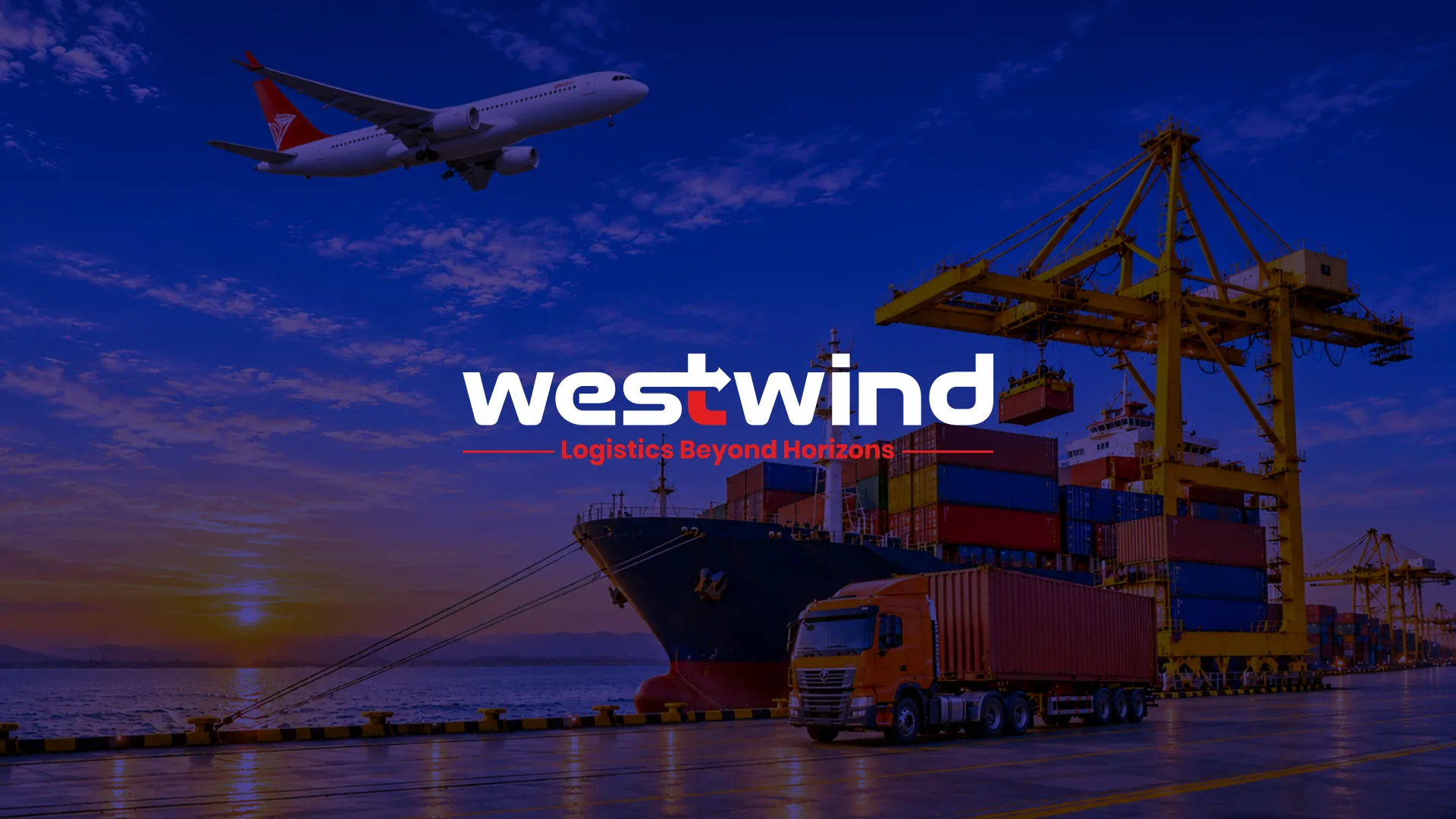
Westwind needed a strong and distinctive visual identity that could reflect its commitment to reliable, efficient, and forward-moving logistics solutions.
The challenge was to create a modern, professional brand presence that communicates speed, precision, and trust while standing out in the competitive logistics and supply chain industry.
The identity needed to represent the brand’s ambitious outlook and establish a consistent visual language across different business communication platforms.

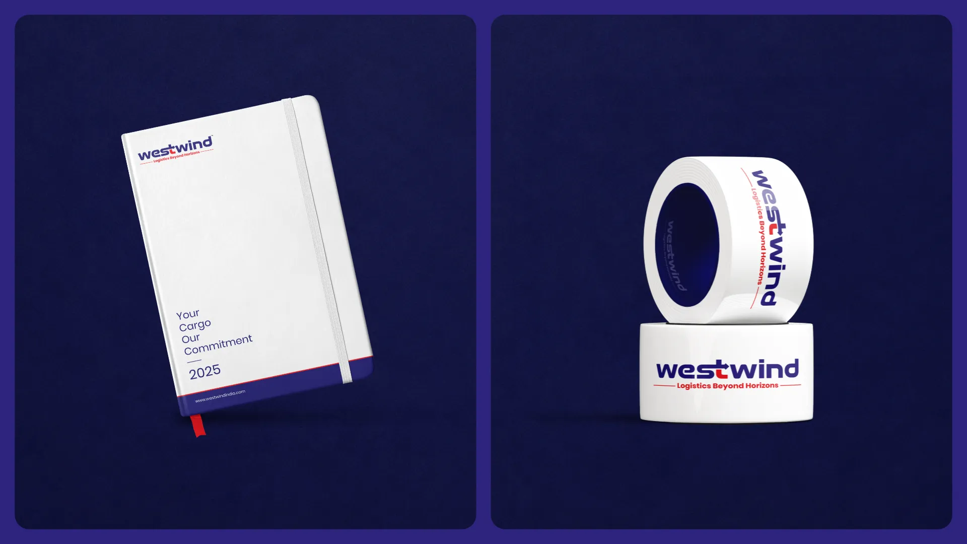
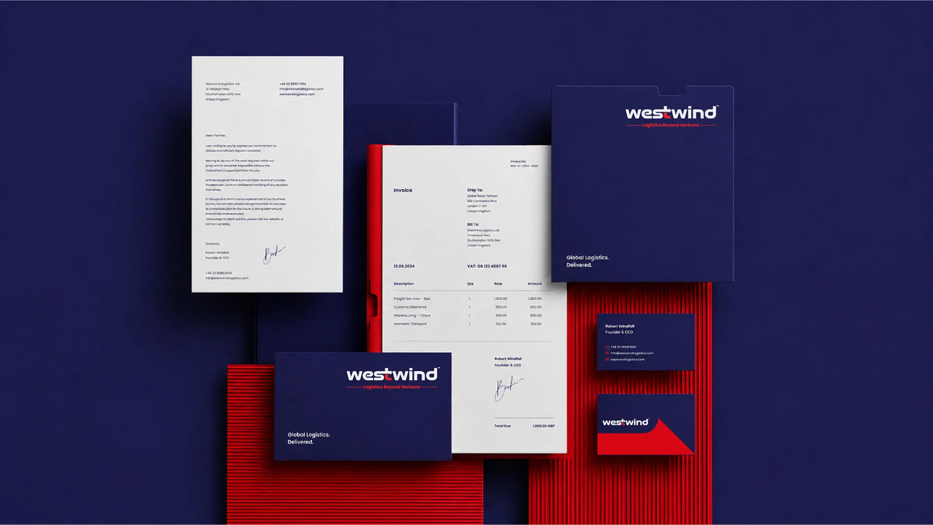
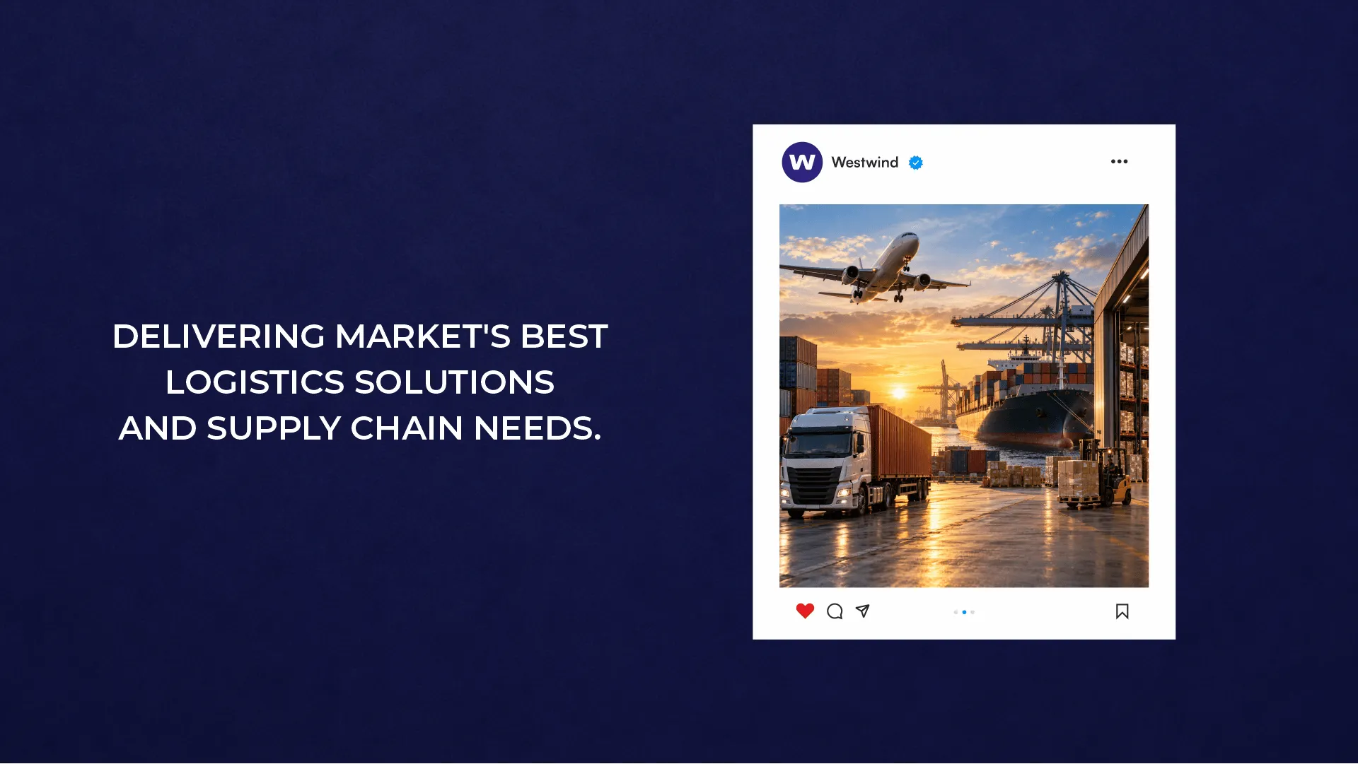
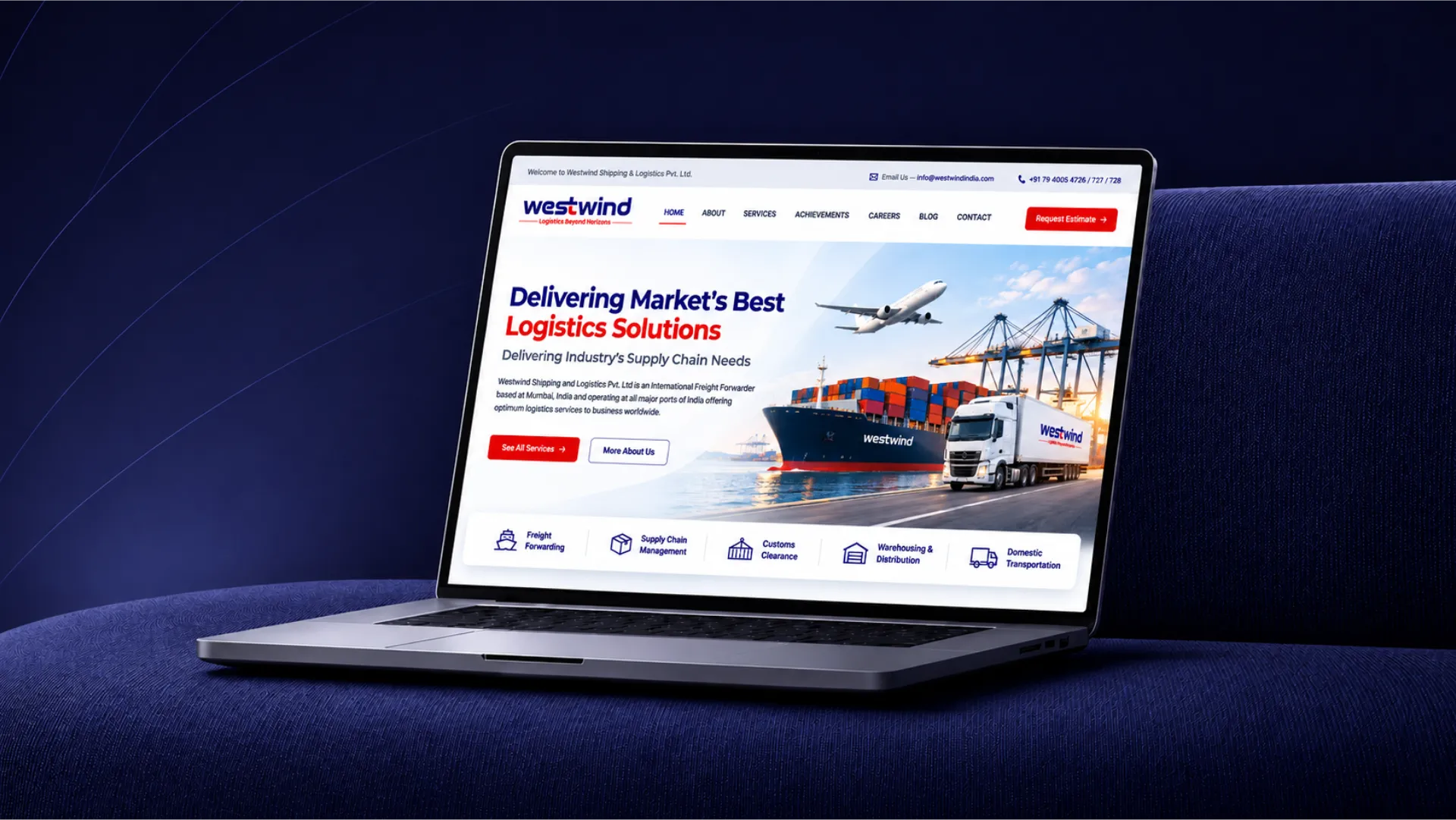

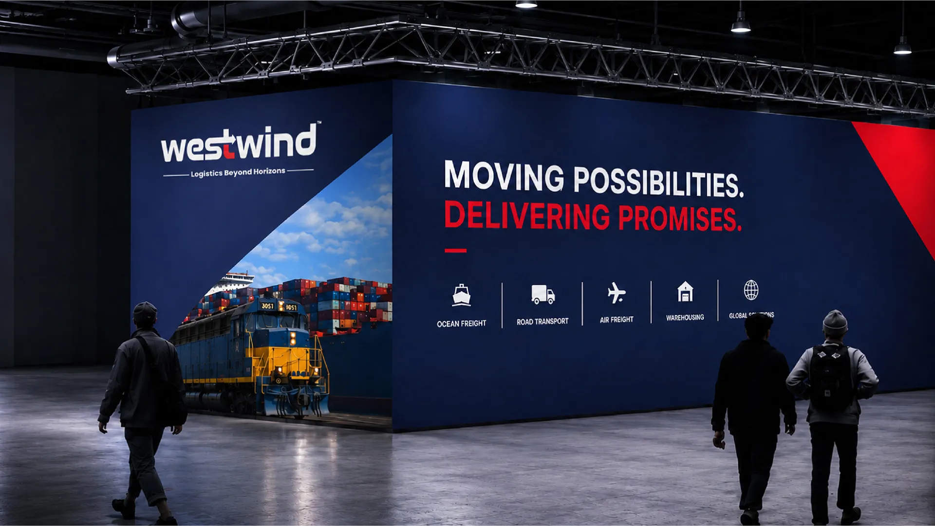
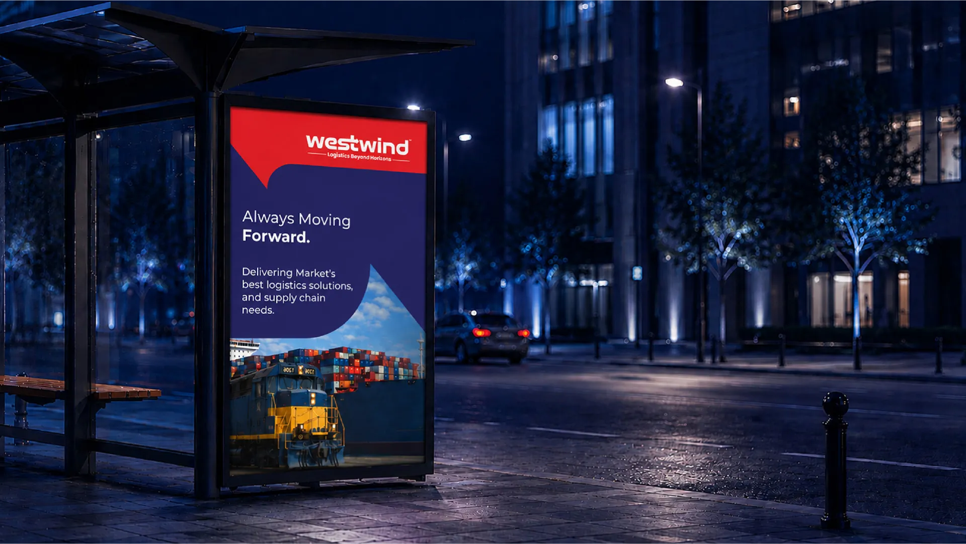
At Dev Opus, we developed a distinctive logo design that reflects Westwind’s forward-thinking approach to logistics and its commitment to keeping businesses moving.
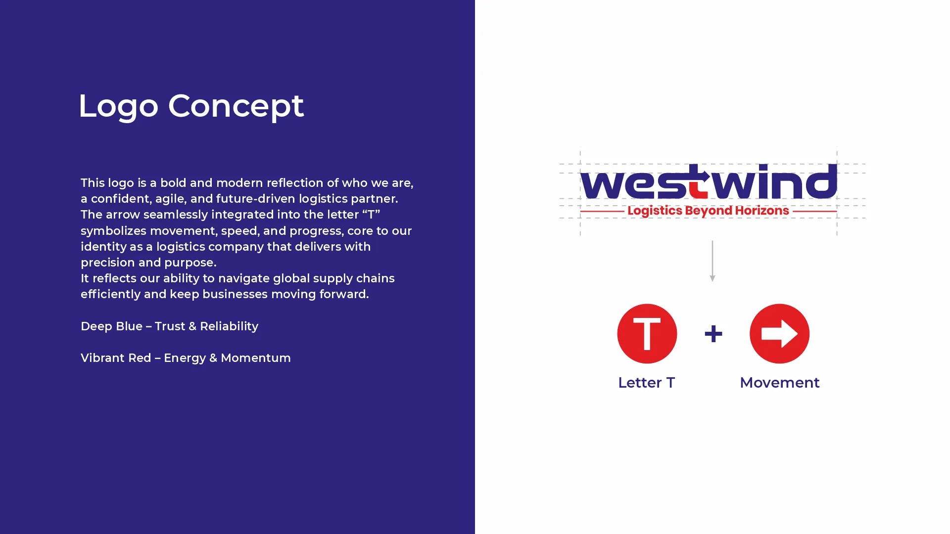
The logo features a cleverly integrated arrow within the letter “T”, symbolising movement, speed, direction, and continuous progress. This subtle design element connects the brand’s identity directly to the nature of the logistics industry.
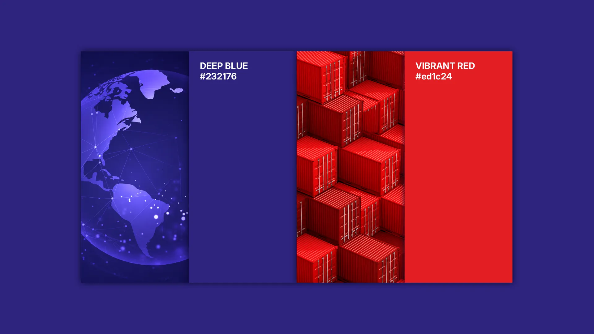
We selected a deep blue and vibrant red colour palette, where blue communicates trust, reliability, and professionalism, while red represents energy, momentum, and action.
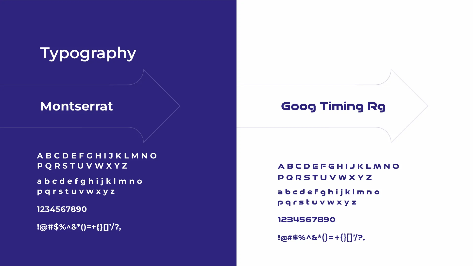
The bold, modern typography complements the logo’s dynamic construction, creating a confident and recognisable brand identity.
We extended these design elements into a cohesive visual identity system, ensuring consistency in colours, typography, graphic elements, and brand presentation.
The identity was further demonstrated through various brand applications, showcasing its adaptability across corporate stationery, promotional materials, and business environments.
Westwind gained a distinctive and professional brand identity that visually communicates its focus on movement, reliability, and progress.
The combination of meaningful logo design, confident typography, and consistent visual elements created a strong foundation for brand recognition across the logistics industry.
Westwind now has a unified visual identity designed to strengthen credibility, support brand recall, and communicate its vision of “Logistics Beyond Horizons.”
Itni Dur Aaye Ho Toh...


Get Free Quote Now!
Get Free Quote Now!