Building DareOn – From Naming to a Complete Brand Identity
Brand Objective
DareOn collaborated with us to build a bold brand identity, right from the name to the packaging, one that could command attention, spark curiosity, and embody strength, energy, and adventure in a highly competitive energy drink market.
We began by creating the name “DareOn” – a simple yet powerful call to action. It captures the fearless spirit of the brand and speaks directly to its audience: stay bold, stay energized, and keep daring on.
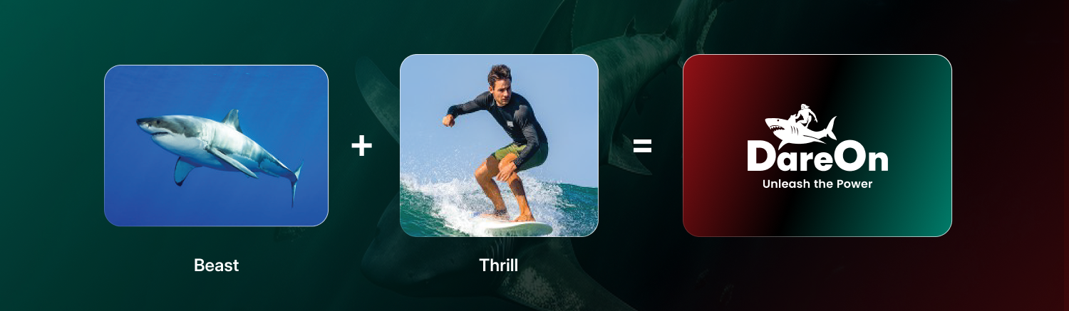
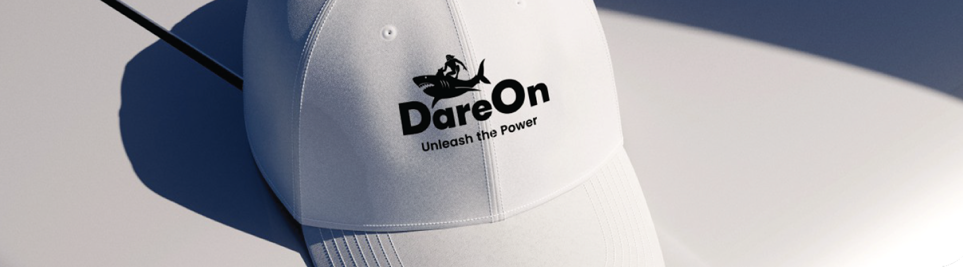
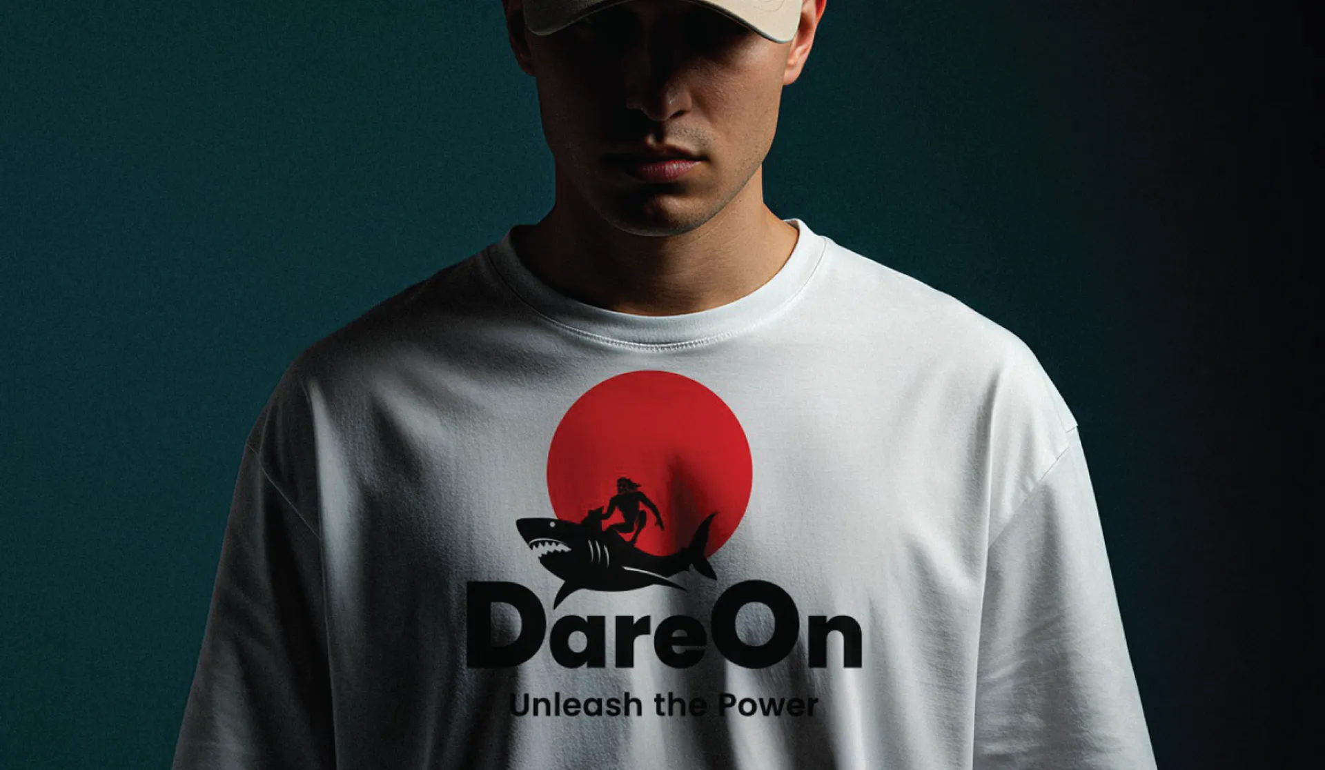
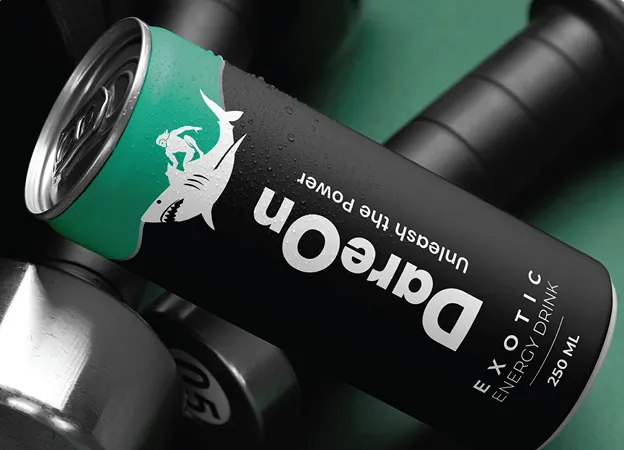
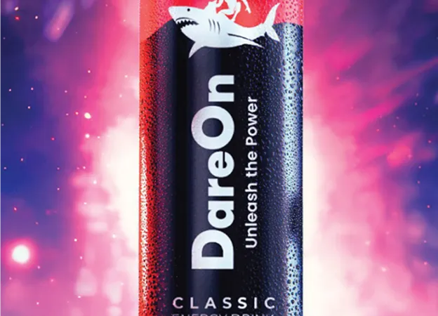
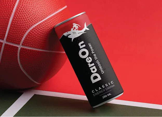
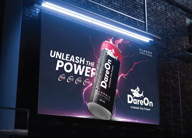
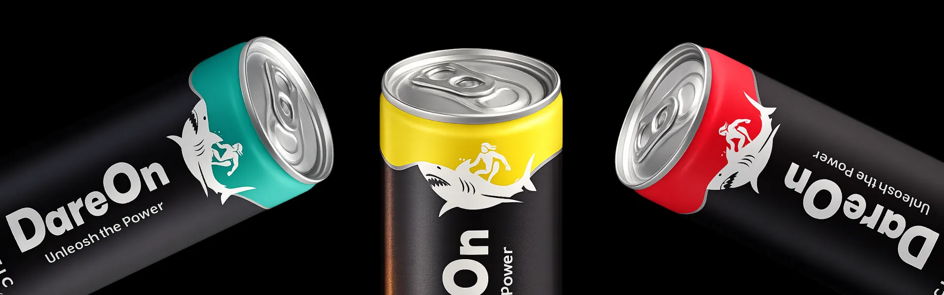
The logo was designed to bring this vision to life. Inspired by the raw thrill of adventure, we illustrated a surfer riding a wild whale. The whale, a symbol of dominance and raw power, combined with the surfer’s energy and control, perfectly reflects the unstoppable burst of strength that DareOn delivers. It’s more than just a logo – it’s a story of courage, adventure, and boldness.
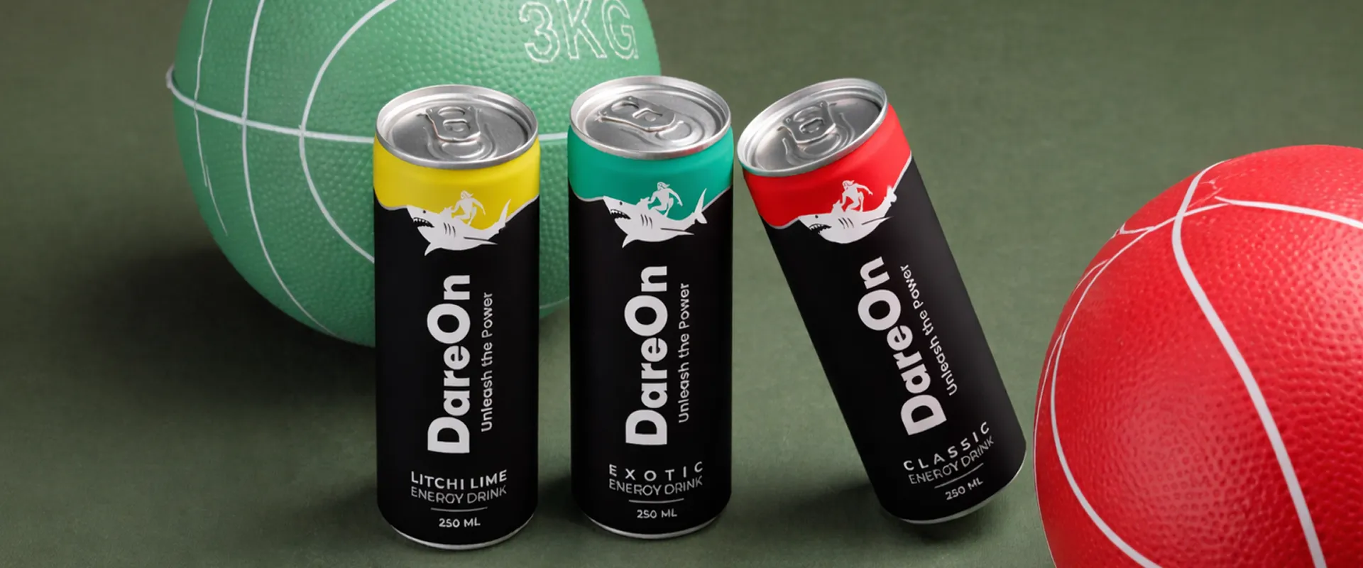
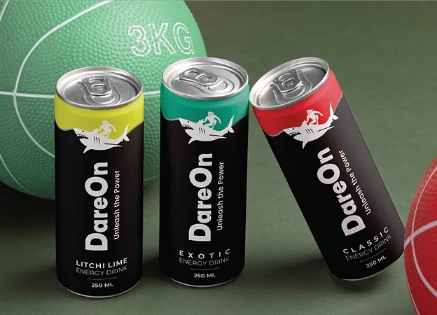
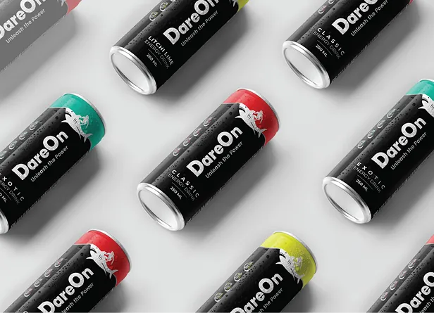
For the packaging, we intentionally kept the design minimal yet striking. Using strong color blocks, clean typography, and the bold logo as the hero element, we crafted a design system that is instantly recognizable on shelves. Instead of clutter, the focus was on clarity and strength – ensuring DareOn cans stand tall and get noticed, even against heavyweight global competitors.
Result
What began as a raw concept transformed into a commanding brand presence. With its daring name, adventurous logo, and powerful packaging, DareOn now looks and feels like a true challenger in the energy drink market – an identity that doesn’t just compete but dominates.
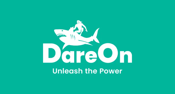
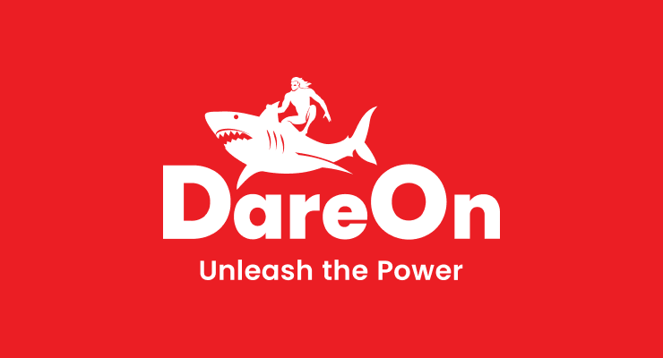
Logo & Identity system
Packaging Design
Let’s Turn Your Product Into A Powerful, Unforgettable Brand.
Whether you’re launching something new or reinventing an existing product, our branding experts craft identities that demand attention, build trust, and drive growth.